I'll be at my computer tomorrow, just as I am today. I'm making an effort to connect people who can help with information and ideas they can use to help bridge the divides in America, to create greater opportunity for all. I think I can have a greater impact by doing this, than by any service project that I might do.
I've been working on this post for a few days. I hope people will find time to read it tomorrow, or in the next few days.
Last Thursday I attended the Chicago Opportunity Zones event held at the new Malcolm X College in Chicago. I joined with a few others using Twitter to share what I was hearing, so visit
#LiveatUrban and scroll through the Tweets to learn more about the Opportunity Zones (
Called "O-Zones" by one speaker. A term I use often below.)
The final speaker was the new President of The Chicago Community Trust, who in the Tweet I've posted below said “Now is the time of action. We can't let perfect be the enemy of good.”
To me, part of those actions is doing the research and learning, to identify places where people need help, and to offer time, talent, dollars and other types of support to organizations and businesses in those areas.
One panel was moderated by Derek R.B. Douglas, Vice President for Civic Engagement at the University of Chicago. In his remarks, he said, “The biggest thing we have to do when we leave this room is form the partnerships and connections to get to work.”
Since 1993 I've been trying using maps to help people form those "partnerships and connections". Maps can be used to focus attention on places where people in Chicago need extra help, so the first thing that came to my mind was “What neighborhoods are affected?” And, “What indicators were used to show these areas need this government supported capital investment?”
My friend Dan Isherwood, one of the co-founders of
Urban Initiatives back in the early 2000s, looked up the info and sent me a link to this map from the City of Chicago web site. I created a short link that I could share easily.
https://tinyurl.com/Chi-O-ZoneMap
Then I created a series of maps which I've posted below.
The Opportunity Zone map is shown at the right in the following graphics. In the first map I've used a
demographics mapping site to show Chicago. The green color shows areas with a high density of African Americans. By comparing the O-Zone map with the one on the right, you can see that the Opportunity Zones are targeted to help this sector more than others.
This next map shows the
Chicago Tribune “
shootings tracker” site, which shows locations of Chicago shootings for past 365 days. There's a definite overlap with O-zones but there are other areas which also need investment.
The next map comes from the Casey Foundation's
Community Opportunity Map which shows poverty levels in Chicago (and other parts of the country). Using the interactive map you can focus in on specific parts of the city, and generate tables of information. For instance, I created a view focused on the North Lawndale area.
This next set of maps shows non-school youth tutor and/or mentor programs in Chicago, based on a list I've been maintaining since 1994. While most of these are not profit centers that would attract Opportunity Zone investment, they are part of the mix of youth and family support organizations needed to help bring a neighborhood out of deep poverty.
 |
| View Tutor/Mentor Programs map here |
A closer inspection of
my map would show the wide range of programs on the map, and the lack of these programs in many of the O-Zone areas.
So who are some of the potential stakeholders and resources already in these neighborhoods?
On the graphic below I've zoomed into the O-Zone map to focus on the North Lawndale area of Chicago's West side. Then, I used the
Chicago Health Atlas Map to focus on North Lawndale, and show hospitals serving this area.
Hospitals can be employers, can be customers for products and services produced locally, can provide needed health services, and can be conveners who bring stakeholders together. They can also be leaders who help comprehensive youth tutor/mentor programs grow in the area. Using the
Chicago Health Atlas you can also create maps showing health disparities, which are indicators of investments needed in different areas of Chicago.
There were only a few maps shown in Thursday's presentation. One shows investment flows in the Chicago region. That map is shown in this tweet. Notice how the areas with the greatest investment, are just the opposite of those the O-Zone focuses on, which have the least investments flowing into them.
In the
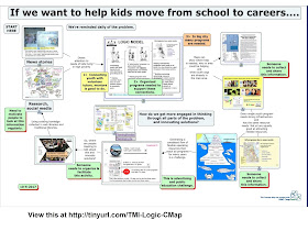
concept map below I point to the platforms I used to create the maps I've shown. These are just a few of the growing number of data mapping resources becoming available over the past few years.
Creating, maintaining, and motivating others to use these platforms offer many challenges. Among these are:
a) Motivating and teaching people to use the various platforms to create maps that focus a story on specific places. That's what I did in the above maps.
b) Locating the different platforms with needed information can also be a challenge, at least from a time perspective. In many cases the data-maps are no longer on-line, so when I open a link it is a dead end. Unless people are really motivated, most won't do the digging needed to put together an effective map story.
c) Building public awareness so more people look at the maps, use them in planning and action steps that bring people together and drive needed resources to non profits and growing businesses in specific areas is also a challenge. People creating the map platforms usually don't have advertising dollars to do the communications needed to attract people to the maps, or to teach others to use the platforms to create on-gong map stories.
These data resources are not profit centers. Thus, they don't qualify for investment zone capital. One role of philanthropy, or other government resources, could be to support the development, constant maintenance and updating, and long-term use of platforms like this.
During the event one speaker said there are already community planning resources. Why not use them to guide investment? I Tweeted out LISC Chicago as an example of this.
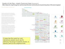
Below is a screenshot is from one of 27 quality of life community plans developed under the lead of LISC Chicago. It shows the Austin Community area. All 27 can be downloaded at
this link.
I don't include it on my data map because it's in a PDF, and not an interactive, on-line map (according to LISC Chicago). Thus while it's a great map, it's only useful to those who have access to it. You can't add layers, or zoom in, to focus on specific areas, or turn it into stories. There may be other map platforms like this in Chicago, or in other cities. I'm always adding to my library and this concept map. Send me links if you have them.
In my own efforts between 1994 and 2011 I tried to build one platform that would provide many layers of information that could be used to support neighborhood based planning intended to make more and better youth serving programs available in high poverty neighborhoods.
 |
Example of map view created using
Tutor/MentorProgram Locator |
The map of the left was created using the Interactive Tutor/Mentor Program Locator's
Asset Map section.
It's no longer functioning properly, although still can be seen on-line.
While I've been collecting and mapping data since 1994, for most of those years I was dependent on volunteers and donated software. In 2007 a $50k anonymous gift, combined with a grant from HSBC North America, enabled me to re-build our in house mapping platform, and to build the on-line interactive platform.
Using ARC GIS software we could create maps showing layers of information and using the interactive platform, we enabled others to create similar maps. Below are two examples. You can see more like this in the
MapGallery created in late 2010.
Unfortunately, the recession, starting in 2008, dried up funding for this by mid 2010. I've not had funds to update this or create these maps since 2011, and it would take a significant investment to rebuild my capacity.
Yet, I feel it is needed because I don't find any other mapping platforms combining all the layers I was trying to combine, and building it into blogs and on-going communications, so community planners could show the need, show existing service providers (and/or businesses) and show assets in, and around, the community who should be involved in any planning process.
Thus, if part of your day of service honoring the life and work of Dr. Martin Luther King, Jr. was to read this article, perhaps you can become the investor, partner or benefactor who
rebuilds the Tutor/Mentor Connection and its on-line mapping, and makes it freely available for others to use in Chicago and cities around the world. Or, you might be a creative social entrepreneur who can figure out how to generate revenue and profit from this, so we could seek capital investors from programs like the Opportunity Zones program.
I hope I can be part of some of those "partnerships and connections" Derek Douglas talked about.
I'm on
Twitter,
Facebook and
LinkedIN. I'll look forward to connecting with you.


