I've used visualizations like the one below for more than 20 years to show the need for long-term, birth-to-work strategies, that reach K-12 youth in every high poverty area of Chicago and other places with concentrations of persistent poverty.
 I included this graphic in this July 2018 article titled "After the march, do the planning". It's one of more than 200 articles posted on this blog that focus on "violence" prevention and "planning". My goal is that youth and adults from around the USA are are reading these articles and sharing their interpretations with friends, family and co-workers to help mentor-rich birth-to-work programs grow in every high poverty area of Chicago and other parts of the country.
You can look at the graphic above in several ways.
1) It includes a map, showing high poverty areas of Chicago. Programs that help kids through school and into adult lives need to be in every one of these zip codes.
2) The horizontal arrow shows the "birth-to-work" timeline, which takes 20-25 years for EVERY youth. Those in high poverty areas don't have the same range of natural support that kids in more affluent areas have, so those supports need to be made available through school and no-school hours programming. I wrote this article focusing on some of the needed programming.

They can show access routes through neighborhoods which might help volunteers see more places where they can connect with youth in organized programs.
They can show locations of programs, and potential support, such as banks, colleges, hospitals, faith groups, etc. We created a Chicago tutor/mentor Program Locator in 2004 and updated it in 2008 to enable people to create a map view showing small sections of the city, that could be used in planning. It's now an archive due to lack of continued funding.
Maps can also show who's involved, as these Tutor/Mentor Leadership and Networking Conference maps demonstrate.
Most importantly, maps can show a distribution of dollars and involvement. Foundations, companies and government programs have the ability to create maps that show where their dollars are landing, and/or where company volunteers are involved as board members, or volunteers serving as tutors, mentors, tech support or marketing and fund raising support.
But there are also other types of maps that planners should be using. View the concept map shown in the graphic below at this link. It shows supports needed at each grade level, in EVERY high poverty area of Chicago and other places.


Here's another concept map to look at. It shows challenges facing people in high poverty areas. While building great school and non-school programs is needed, removing the barriers enables these schools to have greater success.

Now, take a look at maps created with systems mapping tools like KUMU.
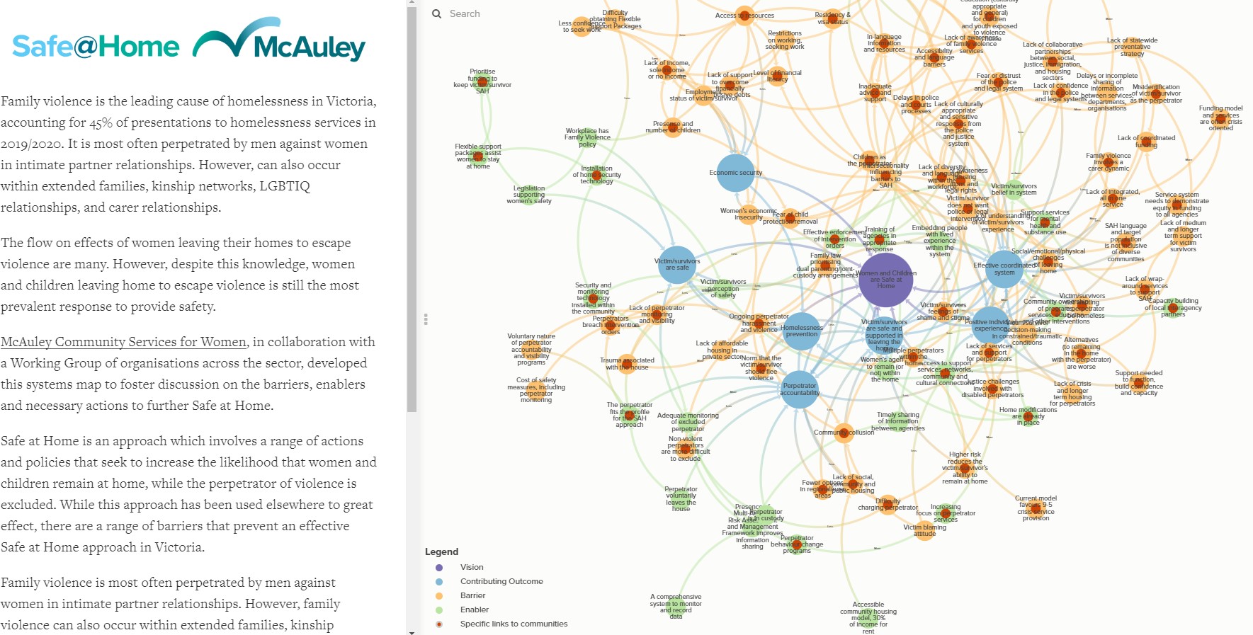
I've posted several articles showing how planners can use tools like KUMU. On LinkedIn I found this post, by KUMU, showing a planning process focused on family violence in Victoria, Canada. Open the project map at this link.
Look at other examples that I've posted in these articles, including one showing how Senator Elizabeth Warren used a KUMU map in her 2016 Presidential campaign to show her strategy for empowering American workers and raising wages.
Look at other examples that I've posted in these articles, including one showing how Senator Elizabeth Warren used a KUMU map in her 2016 Presidential campaign to show her strategy for empowering American workers and raising wages.
Using GIS maps to show where help is needed and systems maps to help understand a problem and potential solutions, and guide resources to places where help is needed, can lead to new and better implementation of solutions.
So far I can find too few examples of maps being used this way, thus, there is little accountability assuring that funds and resources support all stages of the "birth-to-work" timeline, in every zip code where such programs are needed.
So far I can find too few examples of maps being used this way, thus, there is little accountability assuring that funds and resources support all stages of the "birth-to-work" timeline, in every zip code where such programs are needed.
I no longer have the organizational capacity to update the program locator and implement these ideas. Instead, I want to be part of planning teams who read these articles and are trying to innovate ways to implement them in different locations.
In this article I show my 30 year history of reaching out to universities, and my continued goal that one, or many, universities begin doing the work that I describe in this and other blog articles.

As places with a brick-and-mortar investment in communities and a pipeline of students coming from high school to college, then on into adult lives and careers, universities are uniquely able to adopt long-term planning, if donors will provide long-term funding!
If you're doing this work, please use my resources and archives and invite me to help you make sense of it all!
If you're doing this work, please use my resources and archives and invite me to help you make sense of it all!
I'm on these social media channels. If you're interested in knowing more and starting a conversation, just reach out to me.
If you want to help fund the work I'm doing, just go to this page and use PayPal to send your support.
Thank you for reading.
If you want to help fund the work I'm doing, just go to this page and use PayPal to send your support.
Thank you for reading.


No comments:
Post a Comment