
I'll post the link to the full video as soon as it's available. If you visit #SocialCapital on Twitter, and look at Tweets posted today, you'll understand more about what was discussed than what I am sharing in this article.
During the presentation this Social Capital Atlas was described. I've posted a few screenshots below.
This dashboard shows information about economic connectedness, cohesiveness and civic engagement for every county, every zip code, every high school and every college in the nation. Just choose the category you want to view from the menu bar at the top left.

It's an interactive platform, so you can zoom into areas as small as a zip code and get data related to that specific zip code.
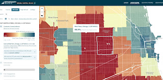

When you choose high schools, or colleges, you get a map view like below, which shows high school in Chicago. The different colors represent high or low levels of connectedness, cohesiveness or civic engagement. Click on an icon to get information for a specific school.

This information is not new to me. I've followed Robert D. Putnam since the early 2000s and wrote this article in 2015 and this article on this blog in 2018. And, in 2019 I pointed to Raj Chetty in this article.
In 2018 I posted this article on the MappingforJustice blog, pointing to an Opportunity Atlas website, which is also a product of Opportunity Insights. However, the Social Capital Atlas is brand new.
My goal is that people use these websites to create stories for blogs, Tweets, Instagram, videos, etc. that draw more attention to the inequalities in America, and more motivation to provide the time, talent and dollars to close these gaps, in EVERY zip code.
Here's an article where I demonstrate using multiple platforms in one story.
Here's an article where I demonstrate using multiple platforms in one story.


Last week I posted this article showing my 30 years of using maps to try to draw attention and resources to high poverty areas of Chicago, to help youth tutor/mentor programs grow and have a greater impact on the lives of young people.
Here's an article from last April, titled "Maps, Time, Social Capital" which uses the graphic shown below.

Click the social capital tag at the left and scroll through the articles. Visit this section of the Tutor/Mentor library to find more articles about social capital. Use this concept map to locate other data platforms that you can use in your stories.
Share these articles and help mobilizer more people who will work to close the opportunity and racial gaps that divide Americans from each other. Learn to use maps in stories, the way I've demonstrated, as part of a call-to-action that draws resources directly to the zip codes and community areas where help is most needed.
Share these articles and help mobilizer more people who will work to close the opportunity and racial gaps that divide Americans from each other. Learn to use maps in stories, the way I've demonstrated, as part of a call-to-action that draws resources directly to the zip codes and community areas where help is most needed.
Thanks for reading. Please use these resources and connect with me on one of these platforms.
Finally, please consider a small contribution to help fund the Tutor/Mentor Institute, LLC and my ability to keep aggregating information and sharing these ideas.
8-17-2022 update - here's a blog article from Brookings.edu that summarizes the information in the webinar. It's titled: "Seven Key Takeaways from Chetty's New Research on Friendship and Economic Mobility". click here to read.


No comments:
Post a Comment